PROCEDURES
First of all, we chose the channel Arte because the corporate identity was very appealing for us. We analyzed existing Arte teletexts and considered how we could improve them visually and technically.
GOAL
After an intensive analysis of the screens we noticed how complex, overloaded, inconsistent and confusing the pages actually are.
So we defined the following goal for ourselves:
Our redesign should offer the best possible user experience.
The design and the navigation of the app should be well-structured, limited to the most important things, easy to understand and oriented to the style and philosophy of Arte.
Therefore, we analyzed and reduced the individual elements. In the next step, we used our results to develop a suitable structure for the individual pages and start developing wireframes.
PROCESS
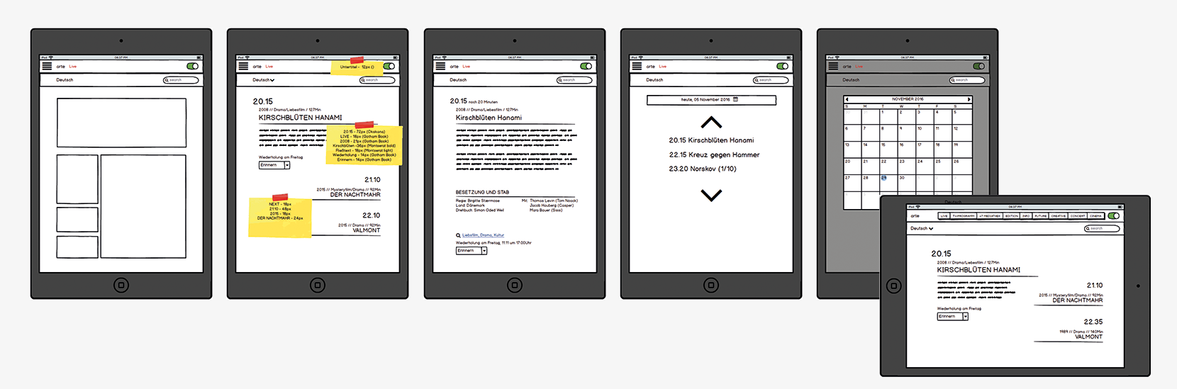
![]() Before we started with the first design drafts, we created a grid in order to create the content in a simple, fast and structured way. In this case we chose an 8-column grid.
Before we started with the first design drafts, we created a grid in order to create the content in a simple, fast and structured way. In this case we chose an 8-column grid.
![]() We also took a close look at the Arte website and considered how the style could be transferred to a tablet app and which design elements we wanted to adopt.
We also took a close look at the Arte website and considered how the style could be transferred to a tablet app and which design elements we wanted to adopt.
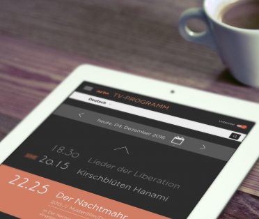
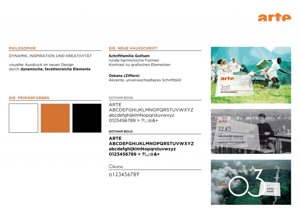
![]() We developed a style guide based on the existing Arte corporate design, which is characterized by a strong visual expression. The focus was on the main colours, the typography and the dynamic, multi-faceted elements.
We developed a style guide based on the existing Arte corporate design, which is characterized by a strong visual expression. The focus was on the main colours, the typography and the dynamic, multi-faceted elements.
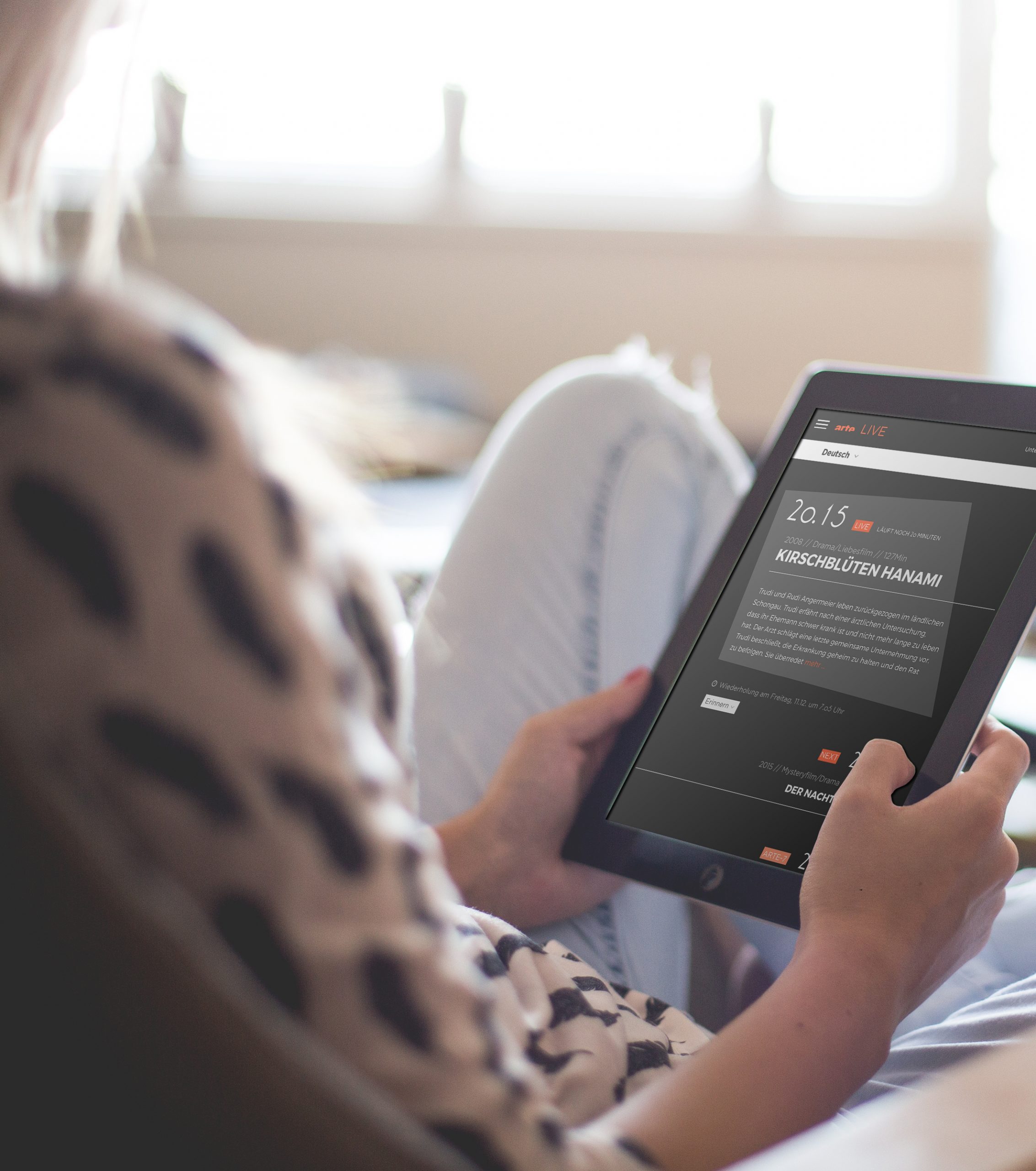
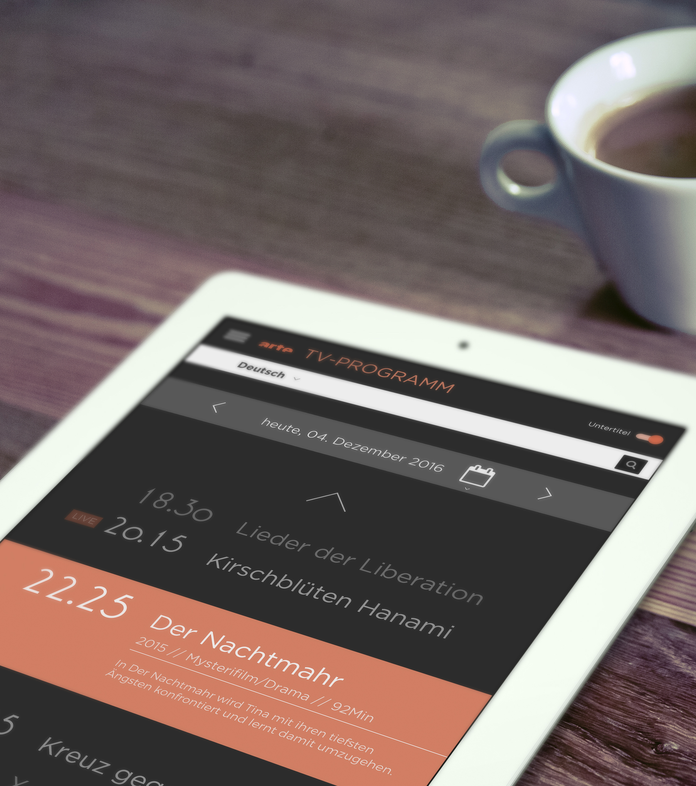
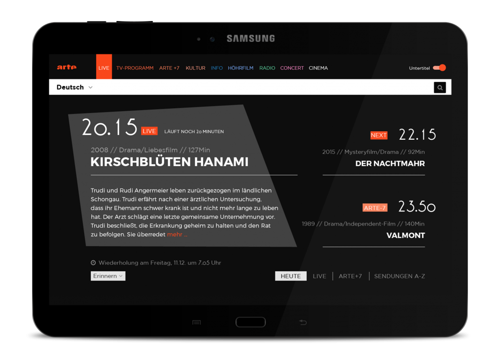
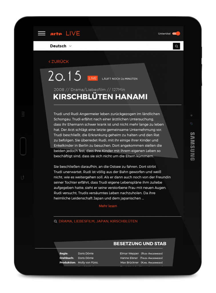
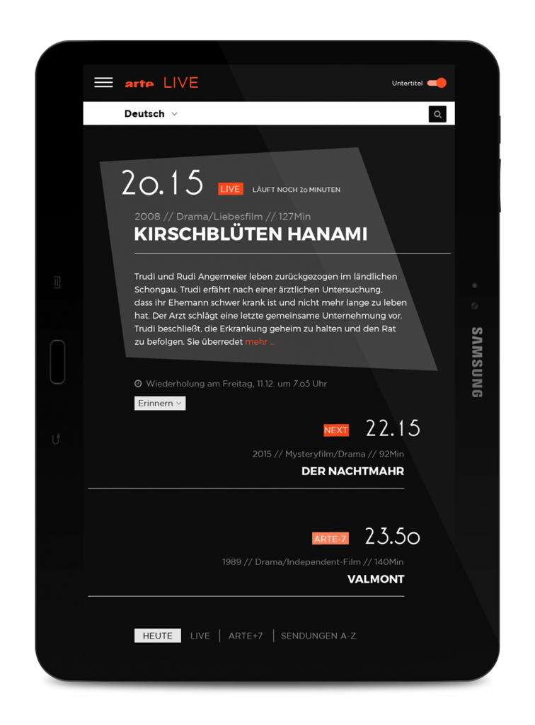
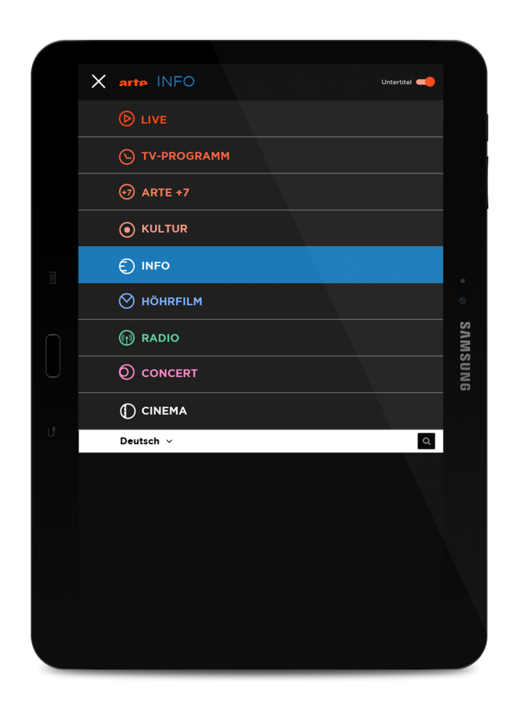
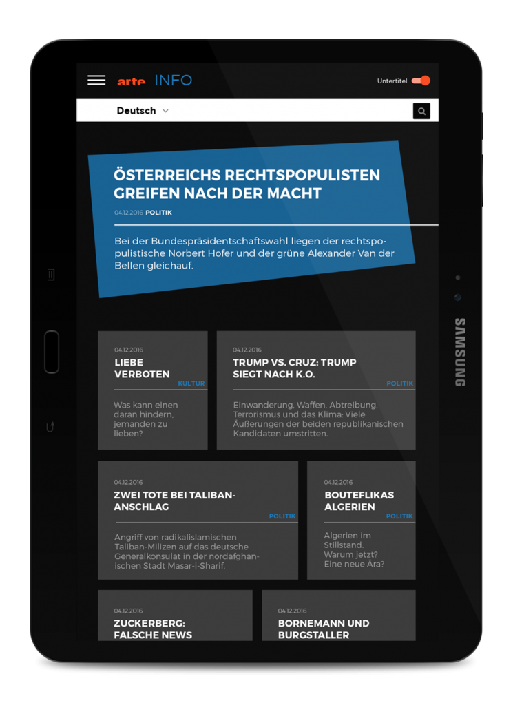
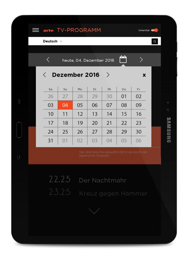
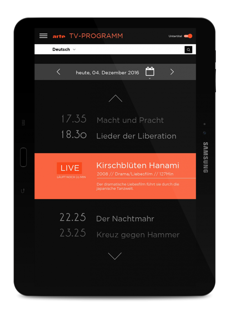
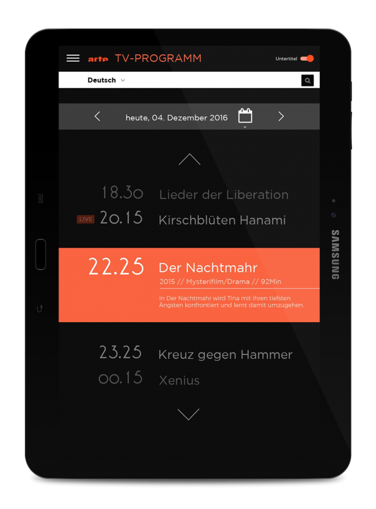
RESULT
Each element was developed and optimized until it was sufficiently well-designed. We paid attention to a consistent design of the pages and a good UX design.
Here are the final screens we’ve worked out:
RELATED PORTFOLIO